First of all we arranged all our photos on the table and created a list of every category they could fall in to. From hear we narrowed it down to 10 that we thought covered a broad range of topics.


Questions
- Who is the Client?
- Who is the intended audience?
- What is its function?
- Whats the budget?
- Where is it from?
- Who is the designer / Studio?
1. Carl Wine
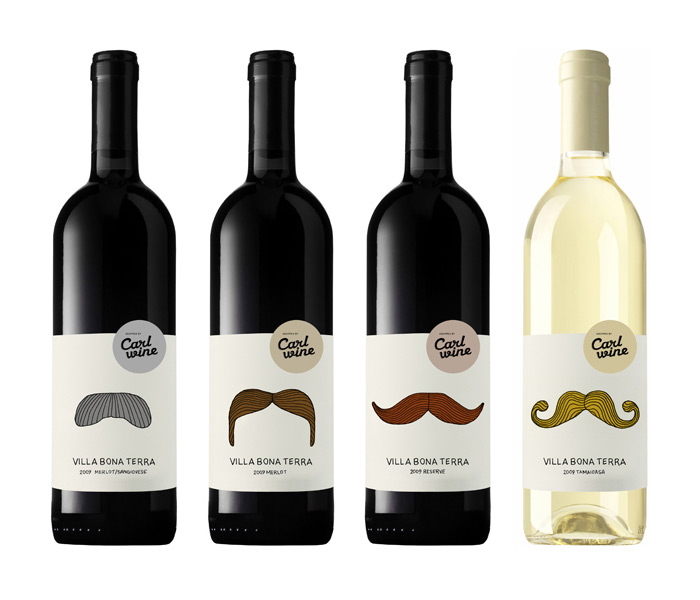
- Carl Wine
- Wine users, 18 + mainly young adults, the packaging illustration style is more suited to the younger generations. It doesn't scream high end wine as its quite playful and humorous
- Humorous way to represent what wine people are drinking without having to pay too much attention to the label. Makes drinking wine more appealing to the younger generation.
- Low budget - Simple design with a limited colours used. There have been no expensive printing processes used to make the packaging.
- Denmark
- Lovely Package
2. Slanted Magazine

- Slanted Magazine
- Graphic Designers - young trendy designers....edgy
- To educate, inspire and inform typography enthusiasts and graphic designers
- High Budget, as it is mass produced, the style suggests its quite up to date and widely used. As the magazine format requires use of lots of colours and nice stock it could potentially cost allot to create.
- Germany
- Slanted Magazine
3. Fast Eddies Branding

- Fast Eddies Barber Shop
- The sophisticated man. It looks quite classy but still quite playful. The black and white colour scheme suggests the products are targeted at an older audience rather than a younger one.
- To promote and brand a barber shop, Complete with business cards, headed paper, envelopes, price list and more.
- The quality of the products suggest it has quite a high budget. There are a range of products also which would add value to the promotional items. The rounded off edges suggest there has been additional processes used which would result in extra costings.
- America, Allston Massachusetts
- Richie Stewart
4. Ceramic Cup

- Private Ceramist
- Tea drinkers, late teens/young adults, quite feminine
- To make a tea cup more interesting, add humour to an everyday task
- Low Budget, single colour print
- China....maybe
- Designer's Block UK
5. The Potato Lifecycle

- Self guided work
- People interested in healthy eating, farming, vegetables, people who want to grow potatoes
- To inform people of the best time to cultivate potatoes and the environment they need to be in
- Low budget, vector based graphic, no phototgraphy used, not much ink needed to produce print
- Portland OR, USA
- August Winfield http://www.flickr.com/photos/augustwinfield/
6. Shop Window

- A Bistro
- Shoppers, people out and about of any age but probably mostly young professionals
- To inform people of what the cafe offers
- Medium budget, design could have been carried out with cheaper materials however the design would not look as clean and crisp
- Bath. England
- http://www.imgspark.com/image/view/4f86eadcfa99b942040001fe
7. The Black Keys

- The Black Keys
- People who listen to the music of The Black Keys, from the age group of around 16-40
- To promote a gig performed in Iowa by The Black Keys
- Medium to High budget?
- The poster is from Nebraska, America. It is an international design
- The poster has been designed by a design studio based in Nebraska, America called Doe Eyed
8. Illustrate People

9.WELOME TO CHICAGO

- The record company/musicians themselves trying to promote the mix tape
- People interested in the new mix tape, music fans, people that have heard of 'Welcome to Chicago' younger audience
- The function is to promote an upcoming mixtape, the work is a series of posters to advertise the mix tape, Welcome to Chicago
- low-mid?
- The designer is from France but this particular design is from America, it is international.
- Jean Mosambi- a freelance graphic designer who likes to add a retro look to his design work and work particularly on the promotion of music and album art work
10. FONT FACE

- The typographic face painting and photography was a self initiated and personal project between designers.
- Those interested in graphic design, typography legends, type design, illustration video and photography.
- A series of posters merging the expressiveness of manual gesture and type design in honour of four outstanding typefaces.
- Medium budget, have to consider the expense of models, makeup artists, photographers and designers involved?
- A small studio located in Gijón in Asturias in the north of Spain, 2010.
- It was set up by Raúl García del Pomar and Ismael González, two designers in association with Apito.
No comments:
Post a Comment