In todays session we each brought in our items for both packaging and branding and identity we made lists of High, middle and low quality items. We disagreed on a few items but generally all had the same idea.
First of all we arranged all our photos on the table and created a list of every category they could fall in to. From hear we narrowed it down to 10 that we thought covered a broad range of topics.
Questions
Who is the Client?
Who is the intended audience?
What is its function?
Whats the budget?
Where is it from?
Who is the designer / Studio?
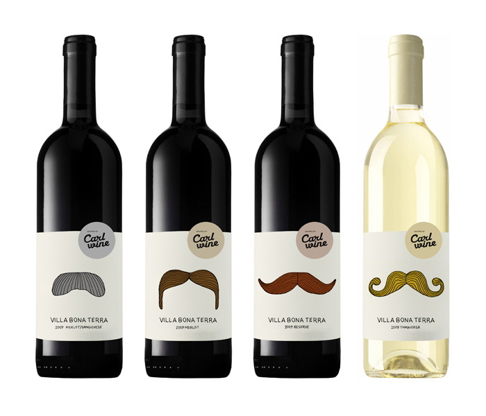
1. Carl Wine
Carl Wine
Wine users, 18 + mainly young adults, the packaging illustration style is more suited to the younger generations. It doesn't scream high end wine as its quite playful and humorous
Humorous way to represent what wine people are drinking without having to pay too much attention to the label. Makes drinking wine more appealing to the younger generation.
Low budget - Simple design with a limited colours used. There have been no expensive printing processes used to make the packaging.
Denmark
Lovely Package
2. Slanted Magazine
Slanted Magazine
Graphic Designers - young trendy designers....edgy
To educate, inspire and inform typography enthusiasts and graphic designers
High Budget, as it is mass produced, the style suggests its quite up to date and widely used. As the magazine format requires use of lots of colours and nice stock it could potentially cost allot to create.
Germany
Slanted Magazine
3. Fast Eddies Branding
Fast Eddies Barber Shop
The sophisticated man. It looks quite classy but still quite playful. The black and white colour scheme suggests the products are targeted at an older audience rather than a younger one.
To promote and brand a barber shop, Complete with business cards, headed paper, envelopes, price list and more.
The quality of the products suggest it has quite a high budget. There are a range of products also which would add value to the promotional items. The rounded off edges suggest there has been additional processes used which would result in extra costings.
America, Allston Massachusetts
Richie Stewart
4. Ceramic Cup
Private Ceramist
Tea drinkers, late teens/young adults, quite feminine
To make a tea cup more interesting, add humour to an everyday task
Low Budget, single colour print
China....maybe
Designer's Block UK
5. The Potato Lifecycle
Self guided work
People interested in healthy eating, farming, vegetables, people who want to grow potatoes
To inform people of the best time to cultivate potatoes and the environment they need to be in
Low budget, vector based graphic, no phototgraphy used, not much ink needed to produce print
People who listen to the music of The Black Keys, from the age group of around 16-40
To promote a gig performed in Iowa by The Black Keys
Medium to High budget?
The poster is from Nebraska, America. It is an international design
The poster has been designed by a design studio based in Nebraska, America called Doe Eyed
8. Illustrate People
9.WELOME TO CHICAGO
The record company/musicians themselves trying to promote the mix tape
People interested in the new mix tape, music fans, people that have heard of 'Welcome to Chicago' younger audience
The function is to promote an upcoming mixtape, the work is a series of posters to advertise the mix tape, Welcome to Chicago
low-mid?
The designer is from France but this particular design is from America, it is international.
Jean Mosambi- a freelance graphic designer who likes to add a retro look to his design work and work particularly on the promotion of music and album art work
10. FONT FACE
The typographic face painting and photography was a self initiated and personal project between designers.
Those interested in graphic design, typography legends, type design, illustration video and photography.
A series of posters merging the expressiveness of manual gesture and type design in honour of four outstanding typefaces.
Medium budget, have to consider the expense of models, makeup artists, photographers and designers involved?
A small studio located in Gijón in Asturias in the north of Spain, 2010.
It was set up by Raúl García del Pomar and Ismael González, two designers in association with Apito.
1. Identify and explain 5 reasons why you chose to study on this programme.
When I was studying my foundation diploma at the Vernon street building I had been told about the Graphic Design courses good reputation. I had visited Blenheim on several occasions and had also seen the quality of work that was coming from the course which certified it for me.
The studio environment appealed to me also, I liked the fact that the classes were smaller than most institutions, this makes it allot more personal and gives you more time with the tutors which helps allot.
From visiting the college I knew about the facilities here which was another one of the main reasons I chose leeds. There are several mac rooms and a brilliant screen printing workshop which took my fancy.
From seeing the employment rate of the graduates, I felt I was allot more likely to come out of Uni with a Job and skills of a professional.
Another reason for choosing Leeds, was the fact it is local so it is easy for me to go home and see friends and family.
2. Identify and explain 5 things that you want to learn during your time on the programme.
I am looking to learn business skills as well as design skills, as this is just as valuable. Half the job of being a designer is being able to sell yourself and your work. Having the skills to negotiate with clients is very important. Gaining respect in the industry is very important.
I am also looking forward to the motion graphics part of the course. I have always been fascinated by animation. This will prove a valuable skill in the long run. Here is a video on Creative Inspiration I found interesting. I really like the combination of both digital hand made media.
I want to learn to present better as I am not as confident as I would like. I know this only comes with practice though so this is something that will slowly get better over the years.
I need to learn to manage my time better, I struggle to plan my time and find myself getting stressed out allot. I am hoping that this year will be different. I plan to stay longer after college to get work done and try avoid taking work home.
I also need to learn more tricks on illustrator and photoshop. At the moment I have pretty much no photoshop skills and only basic illustrator ones. This will help to produce work to a high quality at the moment I dont think my work has that professional touch.
3. Identify and explain 5 skills that you think are your strengths.
One of my strengths is my illustrator skills. I am not exceptional but I have the basics down, I have slowly learnt more tricks over the past year which has helped to create work I am quite proud of. I have allot to learn and hopefully the workshops this year will help me out significantly.
I am good at getting work done for the day its due in. Even if I've left it until near the last minute I always manage to complete the brief...sleep or no sleep. This is not a good habit to get into though and I will work on my time management.
I have reasonable drawing skills, and I like to try and get this in my work from time to time. I think it is important to keep in touch with hand drawn methods as people rely on computers far too much.
I have started using a wide range of primary and secondary research sources. Such as books, websites, surveys, magazines and so on. This gives a better range of information than just using the internet.
My attendance is also a strength I think. I had a bit of trouble at the start of last year, but since then I sorted myself out and attended all the sessions.
4. Identify and explain 5 things that you want to improve.
I hope to improve my essay writing and analysing as I felt my essay let me down. I need to use more sources and quotes and structure my essay better. I think a good plan will be the key to writing a good essay.
Time management is a big thing to improve. I was fed up of doing work late at night. This year I am hoping to try and get all my work done at college and leave as little as possible to bring home with me. This way I can get earlier nights making for more productive days.
I am looking to improve all of my adobe suite software skills as this will help to design professional quality products. This will only improve my practice and hopefully the software workshops.
I Need to become a more regular blogger, last year I put my blogging off a bit and found myself blogging for hours before the deadline. If i do a bit here and there it will be allot less stressful.
My typography skills are pretty rubbish, type scares me a bit but it is something I would very much like to get into. This year I will make the effort to try more type based work rather than image.
5. Identify and explain 5 ways that you will evaluate your progress.
Blogging is a goof way to evaluate my progress, it allows you to look back at the process and identify what went well and badly. Writing a brief summary at the end of every brief documents my creative progress.
Crits are another good way of getting feedback on your work. Sometimes you get really 1 sighted when you have been working on a project for a while and it is good to have a fresh pair of eyes to help you see where you have gone wrong.
Reflecting on the brief all the way through the project is a good way. Making lists also helps to check off what you already have done and what you need to do.
Tutorials with the tutors are another big thing here. These help to identify how you are doing over the duration of the course. Their feedback can help you get your priorities sorted and to point you in the right direction. Also to get your grades.
Feedback from friends and family is also a good way of seeing how your work is coming on. Friends are a bit more blunt I think sometimes which helps, as people in your class sometimes hold back a bit from how they really feel.
6. Identify 5 questions that you want to find the answer to.
Will I survive the year?
Where will I be in 3 years time?
What do I want to specialize in?
Will I get a job this year?
Will my time management skills improve?
7. Identify and explain 5 things that inspire you.
Documentaries are a big inspiration for me, They open you up to all sorts of aspects of the world, different cultures, nature, conspiracies thousands of interesting topics that could help to push you in a new direction of research and ideas. I think these are a great way of getting inspiration. I try to watch as many as I can learning more about the world each time.
Music is quite inspirational for me. I find it allot easy to come up with ideas and design if I have some chilling music on that keeps me calm and helps me to get on with the task in hand. The lyrics of songs can be quite helpful too from time to time,
Good design, its helpful to look at other designers work to get inspired by different styles or use of layout or even the colours scheme. http://loulouandtummie.com/
Running is a good way to clear your head. Its easy to start thinking of ideas after I have been exercising.
Visiting new places helps. New architecture new design and new cultures all help broaden your creative thinking. You see different styles of design all over the world and its important to know whats out there.
8. Identify 10 examples of design that illustrate your fields of creative interest.
Lou Lou and Tummie
I really like their illustration style and use of colours. The work is quite abstract
and interesting. Their work is very colourful and visually engaging.
Inksurge was commissioned to design a simple wedding invitation inspired by the banyan tree which was the main idea of the client. Print process - 6x 6 Letterpress finish (front) with 2-color flat design in Bianco White (250 gsm) and flat printing for the back-side (set in Bianco White 130 gsm). It has a beautiful finish and has been
His work involves the construction of small-scale meticulously detailed models using various materials and objects to create emotive landscapes. Every aspect from the construction to the lighting of the final model is painstakingly pre-planned using methods which force the viewers perspective when photographed from a specific angle. Using a mixture of photographic techniques such as scale, depth of field, white balance and lighting I am able to drastically alter the appearance of my materials.Photography is an aspect of design I need to experiment more with.