Tuesday, 10 December 2013
Friday, 6 December 2013
Datashed - Brief Progress
I
have completed most of the work for this brief so far, and just need to
send off my progress to the client. I am really happy with how this has
gone and have found the brief really enjoyable, they have been a
pleasure to work with and have agreed with the majority of my design
decisions. There have been minor changes to make from the previous crit
but I feel I have addressed the issues and produced a consistent body of
work which represents the company well and illustrates the companies
product well. Hopefully there aren't too many changes to make from this
point on. I still have to make arrows etc on top of this but I will
speak to the client about there views on this.
The Main Data Shed Image
From
the last crit we decided it was a bit too orange so I added in a bright
yellow to give contrast to the image. This image works well to sum up
the company and illustrates simply what the software does. Basically
sorting out a big heap of data into a manageable format for companies.
Single Customer View
This
image illustrates the single customer view element to the software
which allows you to piece together bits of data which combines to make
one person. Ofter people have various different intereactions with
companies be it online or in store, this function allows the user to
piece together them interactions and build up a profile of that one
customer without risk of duplicates. The jigsaw man is made up of
various data, and the datashed solves these difficult problems.
Analysis Tools & Dashboard
Click to View
This
GIF explains the nature of the Dashboard and the analysis tools,
showing that when you add more data the information and stats change to
suit the new input, by showing multiple buttons adding information it
emphasizes the flexibility of the software. The GIF also shows the
userbility, and reorganization aspect of the dashboard showing how the
dashboard can be re aranged to suit the specif user.
Icons
The
other part of the brief involved creating a set of icons to use on the
website. After the crit I had with them last week we settled on the 8
icons we would use and work on, here you can see the development stages,
I had to make alterations so that they worked in series, this involved
playing with line strokes and spacing.
Here are some alternate icons I will show to the client but I am not that happy with them
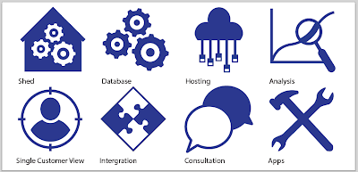
Final Icons
Here are the final Icons, they work well in a series and follow the brand guideline colour scheme. Hopefully they will be happy with how they have turned out. I am happy with how they look and got good feedback from my peers so I am confident they will be happy with them.
Subscribe to:
Comments (Atom)


