Wednesday 19 October 2011

Graphic Design Investigation Task 3 Research

I have been looking at road signs in Leeds city center. On the way home from Morrisons I photographed every road sign I came across. This will help me identify the ways that signs convey their desired message. The colours and shapes of signs are significant I will identify the differences between them.

 Here is a No Entry sign I came across, Red signs are used to warn drivers this simple red circle with a line through it is globally recognized.
 Here is a sign I came across, green is used to represent directional signs. It is simple and bold, the white arrow gives it that final touch.
 Here is another warning sign displaying only text, the text is clear and easy to read. it is spaced out at a good distance making it legible and informative.
 Here is another warning Sign I came across, the sign represents no right turn, this simple icon represents that really well, the red line through the right turn obviously means NO DON'T DO IT!
 This isn't a road sign but I thought it was quite a nice example of Directional signage. The pole informs you about many different directions and is laid out well.

 Yet another Directional sign, this time on a larger scale. The simple imagery displays the possible routes coming up, it is bold and easy to read. There are only a few colours used and generally the same colours are used for similar roads, for example A roads in yellow.
 Blue Signs are used to inform the viewer.
 Informative
 Directional
 Warning Signs are usually Triangular
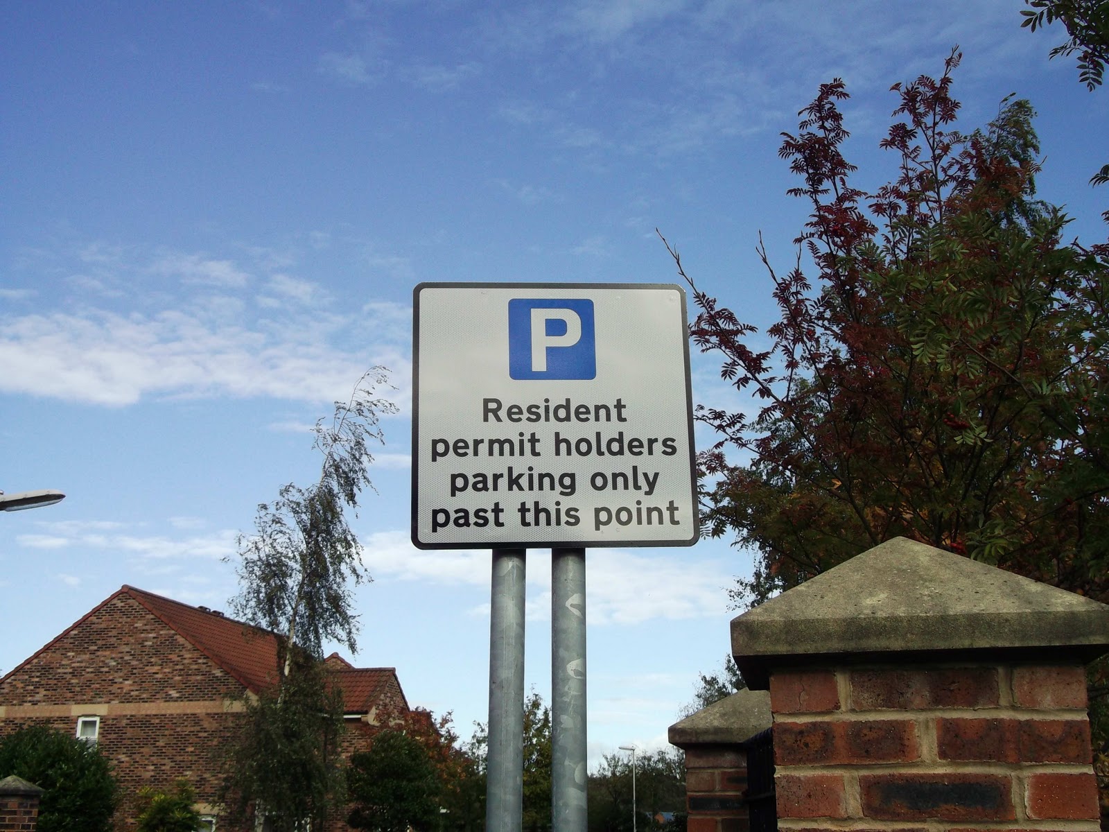
 The white P in the blue square is globally recognized for parking, I think its amazing how we have this kind of visual language that everyone can understand and appreciate.
  Here is another example of great design. The dead end sign is pretty self explanatory. The red line at the end obviously relates to a warning and it looks like a dead end even with this simple image.

Internet Research on Road Signs and Meanings
I looked on the internet to find the meanings behind signs, he is the research i found:
Warning signs for speed bumps and horse riders

Triangular signs
Triangular signs are used as warnings - junctions ahead, road conditions, hazards ahead and so on. A black symbol appears on a white equilateral triangle (pointing upwards) with a thick red border. The usual warning that a road does not have priority at a junction reads "Give Way" and is an inverted triangle. 
Circular signs
Sometimes referred to as "roundels", circular signs give orders. White circles with thick red borders and black symbols give negative instructions - things you must NOT do. Blue circles with thin white borders and white symbols give positive instructions - things you MUST do.
Rectangular signs
Written information is relayed using rectangular signs. These come in many different colours and sizes.
What font is used?
There are two alphabets used on all road signs, which are "Transport Medium" and "Transport Heavy". These are differently weighted versions of the same typeface; "Transport Medium" has a thinner stroke width and is used for light text on a dark background, while "Transport Heavy" has a thicker stroke width and is used for dark text on light backgrounds. Both were adapted from an existing typeface by graphic artist Jock Kinneir in the early 1960s.
Transport Heavy and Transport Medium
Kinneir actually designed a third typeface to complete the set, called Transport Light, which was intended for use on internally lit signs. It was never adopted.

What is the taller font used on motorway signs?
Example of Motorway Permanent. Click to enlarge 
for most of the sign text. However, because Motorway signing was developed separately, a different style is used for the road numbers on motorways; it appears taller than other letters.Both motorway and all-purpose road signs use the same "Transport" alphabets. This different lettering is called "Motorway Permanent"


How does the colour coding work?
Directional signs on different classes of road use different background colours to allow motorists to easily tell between different types of road and information.
Blue signs
Blue signs with white text and white borders are found on motorways, where all direction signing uses this colour scheme.
On non-motorway roads, the same colour scheme is occasionally used for signs bearing miscellaneous written information (such as advance warnings of weight restrictions). They are also used for direction signs for pedestrians and cyclists (which are always accompanied by a pedestrian or cycle symbol).
Green signs
Primary A-roads use green-backed signs, with white borders and text, and route numbers highlighted in gold. Green signs with white text but yellow borders are occasionally seen marking emergency services access points to places like airports and stadiums.
White signs
Signs with a white background are used on non-primary roads, with black text and black borders. Until 1994 there was an additional set that used black text and blue borders for 'local' directions, but these are now being phased out.
White signs also exist with other colour combinations. Those with black text and red borders, for example, are used for directions to Ministry of Defence sites.
Devonshire County Council has a unique system to signpost its minor routes. White signs with no border and all-capitals black text indicate the most minor routes suitable for local traffic; white signs with brown borders and mixed-case black text indicate roads suitable for light traffic; white signs with blue borders and mixed-case black text (the same as those phased out elsewhere since 1994) indicate roads suitable for general traffic.
Yellow signs
Temporary signs, such as diversion routes or direction signs through roadworks, have black text on a yellow background. Recently black-on-yellow signs have been erected in a small number of locations on motorways to draw attention to unusual junction layouts, but this is not standard practice and technically is not permitted. 
Brown signs
Tourist attractions are signed using brown-backed signs with white text and borders. Most also include a small pictogram to represent the attraction (a silhouette of an elephant for directions to a zoo, or of a football for directions to a stadium, for example).
Black signs
Directions for Heavy Goods Vehicles (HGVs) appear in white on black, usually with a pictogram of a lorry to make clear who the sign applies to.

Information found at : http://www.cbrd.co.uk/roadsfaq/

Graphic Design Investigation Task 3

5 x Categories of Graphic Design [investigate/ research]
  • road signs in Leeds City Centre (information graphics)
  • adverts on transport (advertising graphics)
  • instruction manuals for building furniture 
  • children’s books (entertainment graphics) 
  • food packaging on ready meals (information/ instruction graphics)
5 x Forms of Evidence  [to be documented on our blogs]
  • photographs - primary/secondary
  • books (referencing - scanning in)
  • collecting objects/ leaflets/ flyers
  • internet articles (sourced)
  • video/ filming
5 x Examples of Criteria for the Evaluation of “Good” Research [comment/ feedback]
  • relevance to category
  • reliability of source (primary/secondary)
  • Quality/Detail of research
  • Standard of Photographs (resolution/focused etc.)
  • quantity - a good range of varied research

Tuesday 18 October 2011

Study Task 2 // What Is Graphic Design // Part 1 OUG402

What Is Graphic Design

For this section of my 'personal and professional practice' I will collect examples of design that suit the 5 set questions based on the topic 'What is Graphic Design?'. Design comes in many different shapes and sizes. Everywhere you look there are aspects of graphic design. Here are the questions:
  • identify 5 examples of Graphic Design appearing in different contexts
  • Identify 5 examples of Graphic Design performing different functions
  • Identify 5 examples of Graphic Design delivering different types of messages
  • Identify 5 examples of Graphic Design produced using different media
  • Identify 5 examples of Graphic Design produced at different scale 
 Graphic Design Appearing in Different Contexts
  1. Packaging - Graphic design appears on pretty much every single item of packaging in the world, it is used to both protect and advertise the product. Design on packaging is used to draw the potential customers in. Packaging says allot about the product and defines the target audience.
  2. Video Motion Graphics - Graphic Design even appears in aspects of video. The combination of film and motion graphics work together really well. It is used in adverts films and many other cases. The collaboration of the 2 is really spectacular.
  3. Information Graphics - Information Graphics is another context in which Graphic Design is used, the use of recognizable images are used to convey messages and meanings to the view, This could come in the form of instruction manual, safety manual and many other contexts.
  4. Advertising - This is another area graphic design falls into, Design is used to promote and publicize products, companies, events and many other things. Without advertising the retail industry would be terrible.
  5. Branding - Graphic Design is used in the branding of products and companies. Simple memorable design is key here. As its the logos that people remember.
Graphic Design appearing in different contexts

1.  Packaging - Here is an example of packaging I really like, this is for Mayrah Wine, the packaging is simple but engaging, It has a wonderful use of colour which I think works really well, the animals are meant to be jumping up as they are so happy its spring. The wine looks very exciting and intriguing to me which I think gives it that edge. Its beautiful and simplistic.


2. Video Motion Graphics - Graphic Design appears in video too. Below is an E4 advert created by a Graphic Design Student. The concept behind it is good, i like how the turntable scratches between songs, its simple and interesting to watch.


3. Information Graphics - Here is another example of Graphic Design but here displayed in the form of Info Graphics. This has been created by David McCandless, it displays the amount of calories and caffeine in everyday food and drink, it also shows the amount of exercise needed to burn off the calories. The simple shapes used to represent the items work really well. Its easy to read and eye catching.

4. Advertising - This is another area design is involved in. Here you can see the work of Olly Moss. I really like the work he creates. He sticks to only a few colours and creates beautifully hand crafted prints. This simplistic style looks really professional and authentic.

5. Branding - Below is the Fed Ex logo, this is a great aspect of Design. Its simple but very clever, by extended the 'x' to the right height they have created an arrow within the logo which symbolizes there progression and forward motion of the company.

Graphic Design performing different functions

  1. Informing - Graphic design is used to inform others through leaflets, posters and other media. It is used to simplify things for people, making instructions easy to understand through imagery or text. I came across this Info Graphics piece which I thought was quite interesting. Its not exactly well needed information, but it is still interesting to look at and read. This just shows design can be used to inform people about anything! i really like the simple design.
  2. Promotion - Design is used to promote various different things this could be through posters adverts and many other aspects of design. I found this line up for soundwave festival. Design has been used here to promote the festival, I like the layout and type used on this image.
  3. Warnings - Design is used to warn others about danger using imagery and type. Warning signs are everywhere and are designed in a way that anyone can read them of any nationality usually.
  4. Directions - Aspects of Design help to direct and communicate directions to people all over the world. Everyone comes across these signs everyday.
  5. Adverts - Graphic Design is used in practically every advert now a days. Here on this billboard you can see a clever aspect of graphic design. By having the stubbed out cigarette holding the billboard up it immediately draws attention to passers by. Very clever design I think.


Graphic Design delivering different types of messages

  1. Inform and Educate - Design is used to inform and educate the viewer in some cases. This plane safety posters is an example.
  2. Promotion - Design is used to promote also. Shepard Fariey's image of Obama helped his presidential campaign greatly, Shepard Fairy developed global recognition from this image.
  3. Informal - Design isn't always used to promote something, half the time its just to put across a message. I like the work of Shaz Madani, this simple piece of design works really well. It makes you think about how much time designers spend at the computer, Its kind of mocking it I feel.
  4. Professional Branding - Design is used to Brand companies and give them an image to live up to. The amazon logo is a brilliant aspect of design, the logo has a yellow arrow between the first A and the Z letters this yellow arrow implies that they have everything from A to Z and also represents the smile on the customer's face.
  5. Propaganda - Design is used in propaganda also to influence the viewers decision on a topic. In this case it was to try get men to join the army and do their country proud.

1.
2.
3.

4.

5.
Graphic Design produced using different media

  1. Film - Now a days there's tonnes of Design thrown into film. This video is demonstrates the use of animated typography, I think it works well with the voice over.
  2. Print - Graphic Design comes in the form of print also. There are many different printing methods, I like Olly Moss's screen Printing style .
  3. Photography - I like the use of typography in this piece of photography too. Its quite ironic and humorous.
  4. Interactive Media - Design comes in the form of interactive media just like phone apps.
  5. Letter Press - I really like the work of Erin Wallace, her work has a really nice illustrative ouch too it, I like the simplistic colour scheme.
1. 
http://www.youtube.com/watch?v=gGQRtf3_gTI

2.
3.

4.
Graphic Design produced at different scales


1. Outdoor exhibition - Here is a large scale example of graphic design, I like work like this that can be interacted with.
2. Billboards - Here is another large scale example, I think this is a good take on car safety, it takes it light hardheartedly but still conveys the serious message.
3. Album Covers - This is a smaller scale example. This is the work of Alex Pardee, he has a very unique illustration style which I really appreciate
4. Business Cards - I like this letter pressed business card, it looks very professional and smart.
5. Wall Art - Graphic Design is used in Advertising on large walls also. This advert for the Mini works really well. Transforming the building into a garage. Very clever and funny design.

1.

2.