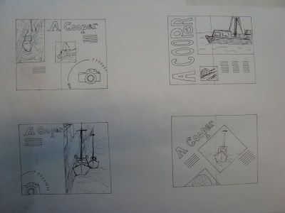
For this brief I researched Andrea a bit and got her to send me some photos I found that she liked simple Scandinavian design and Copenhagen. I have recreated one of her favourite designs and changed it to suit her. I have created a logo that relates to andrea. With her favourite camera as the focal point. I then added other symbols that relate to her. Such as the apple logo, the national danish flower and the white cross from the flag.
Initial Ideas
Initial Ideas
Setting up the image
Experimented with text
I was planning on getting this translated into danish.
I am quite happy with the overall outcome. Andrea really liked it too
and commented on how it resembled Daniel Simms work.
I had fun creating the logo too this was very helpful.


No comments:
Post a Comment