Tuesday, 20 May 2014

Self Branding Web Presence

I wanted to carry the whole golden egg theme through to my website. I think the imagery works really well and will definitely be an eye catching brand which stands out from the rest. How many other golden eggs do you see about? I decided I would keep it relatively simple with not allot of text and mainly lots imagery to show off my work. I want the site to be eay to navigate round whilst also been fun and interactive. I think the image my branding gives off is quite humorous and playful which gets across my personality.
Navigation


I decided I would only have 3 pages on my site, When I start creating more personal work I would like to have ashop section to sell my artwork and products. The main page which it will load on will be the about me page which has a small introduction about myself, but your also given the opportunity to crack open an egg and see whats inside, this is a nice touch which gives the viewer something to interact with. 

This is the layout of the home page/about me section. I have tried to use the same layout through out. Big Egg on the left then 9 small eggs on the right. Simple black and gold colour scheme throughout.


Here is the opening paragraph about me  


There is a message at the bottom telling the viewer to crack open an egg

Before
After


When you click on the eggs on the home page they crack open to reveal the projects within.

Portfolio Page 


I used a strict grid system to build my website, This has helped create a blanced professional layout which is easy to navigate round and will be easy to code as is can be split up into sections.
The big egg lets you sift through the project photos

When you click on a project markers will appear to let you know which it is


Information pops up about each project when it is selected


The arrows on the right hand side allow you to scroll through the different projects
 
Contact Page


The contact page is pretty simple, Big logo with text on the right hand side


 Contact details : email - telephone - address

I am happy with the website. It is simple and eye catching and the branding works well throughout. The imagery is memorable and interactive. It is also easy to navigate round and displays the projects in a fun and interesting manor. I will try and code my website over summer as this is something I have been wanting to do for a while and now I have a bit of spare time I will hopefully be able to get it done.

Wednesday, 14 May 2014

Plans for the Future

I have been thinking about what I want to do in the future as I still don't see a definite direction. Over the summer period I plan to take on some personal projects and improve my printing skills. I have a few Illustration projects in mind which I would like to carry out and hope to complete a series of screen prints in response to this. I also need to work on building my online presense as this is something I have not had chance to do yet. I have an idea of what I want it to look like but I just need help with the coding. I have spoke to a friend who plans to put some time to one side to help me with my website. I have a good range of work now which I am proud of and have tackled briefs of all descriptions. I don't really like to limit myself to one design directions as I seem to like dabbling in a bit of everything. 

I think the hard part now will be finding a studio which will accommodate for all of my needs. I hope to try a few different studios out over the summer period and go for as many visits as possible. Ideally I would like to find somewhere which challenges my skill set and includes me as part of the team. I can not see myself at a massive firm doing all the boring stuff and having to gradually work my up. I know that how it is in a lot of places but It would be nice to find somewhere where I can have more of a say in whats going on.

There are also a few more corporate style briefs I would like to undertake over summer to balance out my portfolio and show a bit more of my diverse design skills as a lot of the briefs this year have been a bit of a personal development. I have done allot of things that are more suited to my own needs as I wanted to experiment with things that interest me. I need show I can also do work thats going to pay the bills, however having more fun personal work may show a client/studio that I am not just a design robot and actually do like to experiment with my own creative needs.

Saturday, 29 March 2014

Google Ident Shoot - Making of

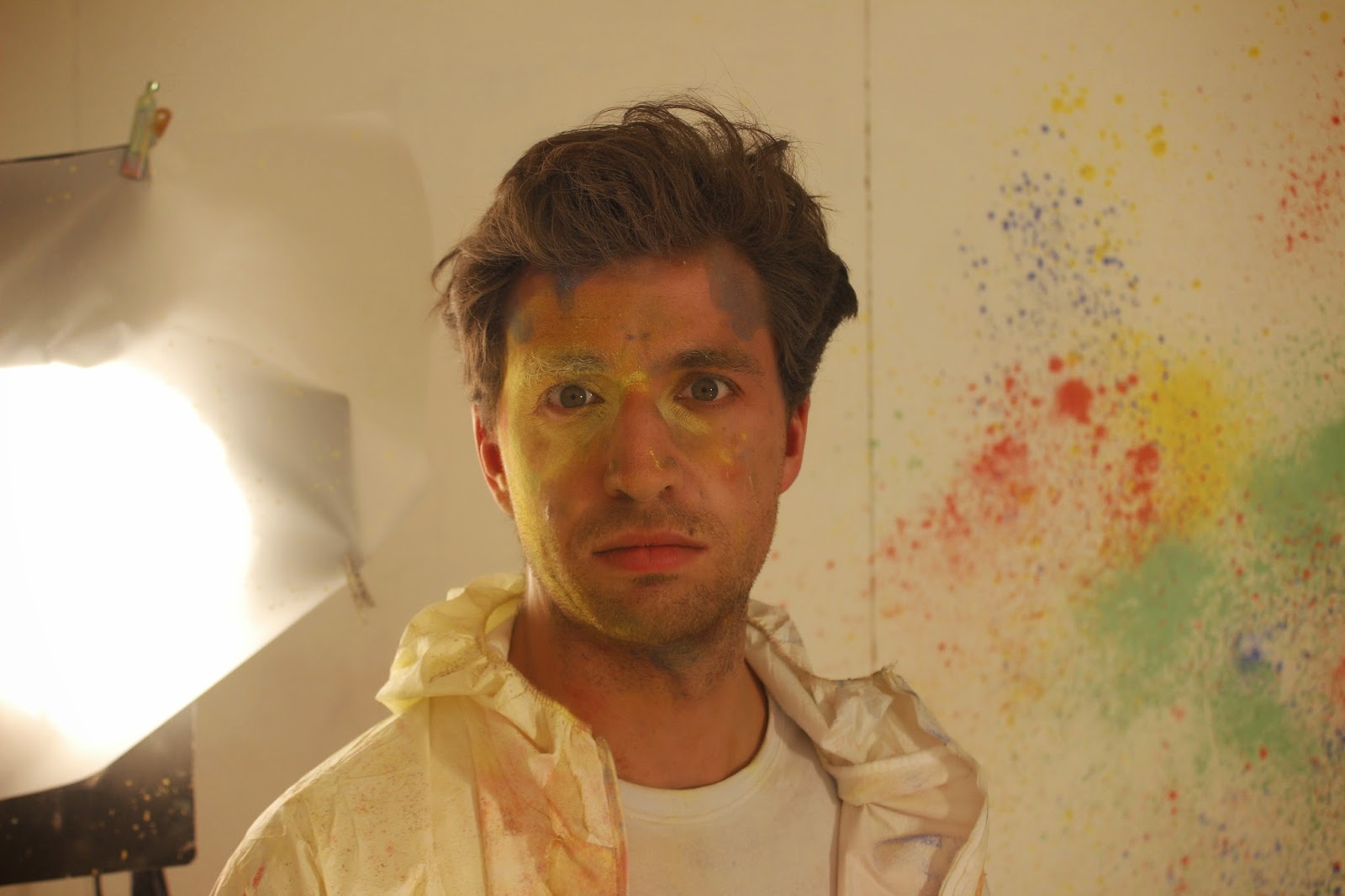
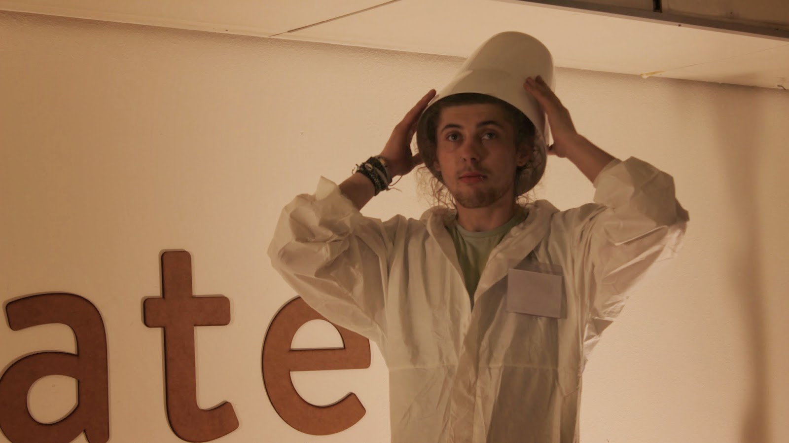
Over the course of the weekend we managed to get both videos shot. This took 2 15 hour days as loads of stuff kept going wrong. We had trouble overloading the power which kept short circuiting the whole building which was a major pain. When we arrived at the studio we had to completely paint it white to keep everything clean and clinical so that there is a nice contrast between the back ground and the objects. We shot the lanterns video on the first day. I acted in this video as the guine pig test subject pedaling the bike all day in front of boiling lighting.

The original edit of the lantern video had a lot of talking, we shot it like a science experiment using a professor and a subject i.e me. This turned out to be not what the client wanted so we had to re shoot parts of it afterwards as they didn't want an talking.

This was a really intense few days full of hard work, it was a really enjoyable experience and gave me an insight into what making a film is like in some respects, there is allot to consider, the lighting needed to be perfect, the positioning needed to be accurate, there were many factors to consider. We ran into many problems over the weekend but we managed to battle through. I also did a pretty good job at acting in the videos which was a bit odd at first as being in front of a camera doesn't really do it for me, but b the end of the weekend I found it pretty fun.


Making of Lanterns Video


Making of Powder Paint Video


Stills


Thursday, 27 March 2014

Google Ident Shoot Preperation

Once we had everything good to go we rented out a studio in Bradford and some lighting equipment for the weekend. We also rented out an amazing camera which could shoot in slow motion for the powder paint video. There was a lot of pressure on at this point as we had eaten away at the budget quite allot with all the equipment and supplies for the film, we only had this weekend to produce the videos as the deadline was creeping up,we needed to save time for the edditing and had another meeting on Monday to show Google the progress.

Tuesday, 25 March 2014

Google Preperation - Testing

 Designing the Boxes for Lanterns


In order to display the logo we had to make boxes to slip over the top of the light bulbs, I created simple boxes on illustrator which would then be cut out on the laser cutter. We would then stick acetate over the gaps to make sure we can stick the letter forms counters back in the right place.

We also needed bases for the boxes so that the crocodile clips can sit nicely and also to make the whole set up look more professional and well thought out. I designed the structure and made sure it fit with theboxes and accommodated for the Jars.


We spent a few evenings staying up glueing everything together making sure to leave one of every object to film properly for the shoot. We had to test the electrics to make sure everything worked in advance so that nothing went wrong on the day of the shoot.
 Painting


In order to keep in tune with the Google brand me and Emily went into town to source spray paint which matched the colour scheme, we had to go to several shops until we had the right paint.

I then spent the afternoon painting all the boxes and the other bits and pieces for the shoot. Here are the black boxes to slip over the lanterns.


We decided to spray the bike the Google colours aswell to keep everything in tune with the brand.


Monday, 24 March 2014

Google Initial Video Script Ideas

Light Bulb Idea

1. first test homemade light bulb, going wrong, getting it right
close-up, hands making, practicing a stop motion set-up

2. stop motion of construction and development of the build of the light-bulb (no hands or human interaction involved) wire wrapping and winding its way around, components coming together in self-assembly…

3. assembling black boxes for the light bulb casing, laser-cutting, painting and putting together all pieces, close-ups, hands…

4. testing out light bulb inside a box, how bright is it, how much colour comes through in a black room

5. bike-generator development, testing out how much power is produced to power light bulbs etc. spray painting the bike into Google colours (time lapse?)

6. neat row of light bulbs, black boxes (pop, pop, pop….) appearing in sequence and then the lights turning off, everything in darkness

7. nothing to be seen, no music, just whirring bicycle sound starting up in the background

8. lights in box slowly turning on until at full glow/brightness

Powder Paint


1. set-up of studio space, the wall with Create logo on, positioning and prepping materials and spray mounting the surface - contrast camera shot of WHITE space against tubs of coloured powder (calm before the storm…)

2. making of slingshots, lots of people all assembling and preparing for battle, dipping finger in their colour paint and smearing across face for battle stripes, tension and build-up

3. close-up shots of facial expressions, calm before the storm, preparing to aim

4. CHAOS. slow-mo shots of colour paint clouds, floating, exploding, splattering against the wall etc. colour chaos people everywhere etc.

5. Colours, clouds and dust all settles to reveal the wall covered in paint (google colours) with the logo still in white gradually clearing up

Sunday, 23 March 2014

Google Idea Story Boards - Pitch

 Home Made Lanterns


Magnets & Iron Filings


Powder Paint


After sending off out story boards to Brandfuel we received the news that Google had decided to choose 2 of our ideas to put into practice. They picked the powder paint concept and also the home made lightbulbs, unfortunately the iron filings version was was too close to an idea Brandfuel had come up with and they preferred theirs. This was awesome and we were really excited to go ahead and get making.