As
a personal project I wanted to experiment with screen printing as this
is something that I have been enjoying over the past few years, but I
have not had the chance or time to do ay personal projects. With this in
mind I set out to produce some prints. I decided to take my inspiration
from festivals and nights out I go to which are decorated heavily
with psychedelic UV wall hangings and trippy art-work, this has been
something which has always interested me from a young age...bright
garish colours that glow in the dark! I wrote myself a brief to give me
some sort of guidelines to follow, but the main thing I aimed to get out
of the project was to improve my screen printing skills.
The Brief - The Mushroom Forest
Create
a UV reactive screen print, taking inspiration from psychedelic
artwork, with the theme being directed towards woodland critters. The
illustration style must be hand rendered rather than digital lines this
fits better with the psychedelic free flowing ethos behind this style of
artwork.
Mandatory Requirements
A2 format
UV Reactive
Screen Prints
Inspiration
I
have taken inspiration from many different aspects. But mainly from
festival art and stage set ups and various events, these kind of night
time raves use lots of UV light and UV reactive paint to create magical
environments which throws so many different things at you. I wanted to
create a trippy mushroom forest, inspired by the magical festival
atmosphere and my love for animals.

Tomorrow Land
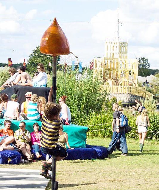
Secret Garden Party

This is a perfect example of the kind of imagery and experiences
that has inspired me. This looks magical.
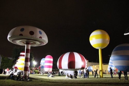
Rainbow City
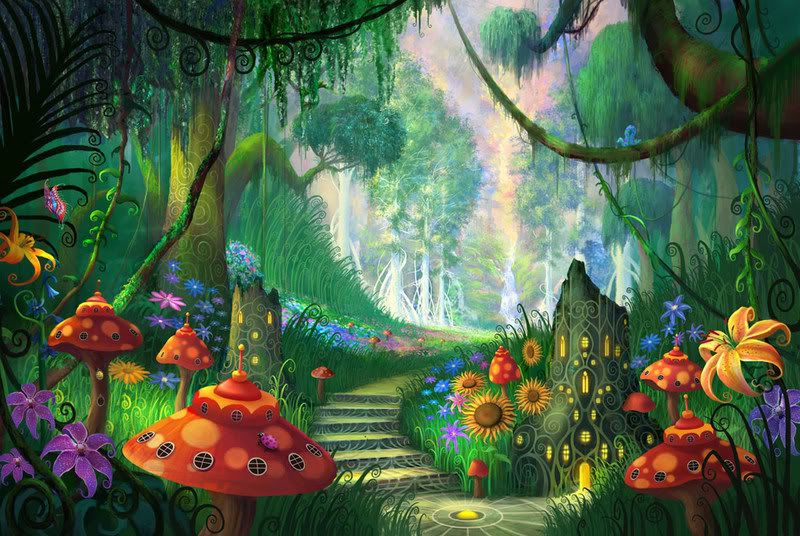
Lisa Kelleher
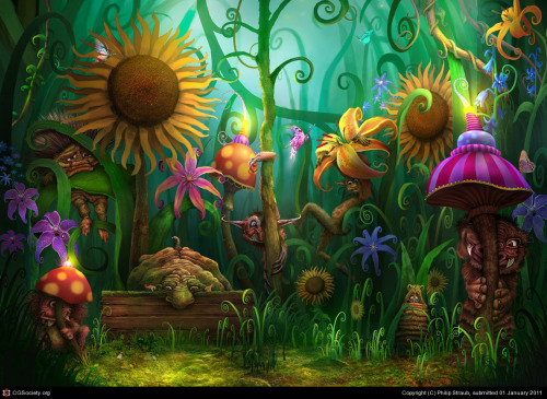
UV ART
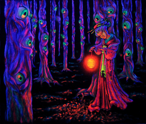
Trippy Forest
Shiva
Mushroom Land
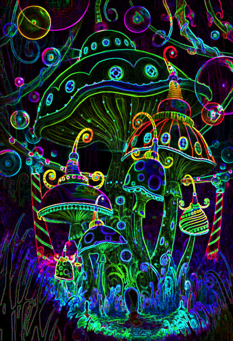
Neon Style Mushroom Land
Design Process
Initial Sketch

In
order to stick with the psychedelic theme I wanted to create a trippy
mushroom forest, I started to think about all the creatures that could
be affected by eating these wild hallucinogenic mushrooms in nature. Its
said that loads of sheep trip balls from eating Magic Mushrooms. I
wanted to create an illustration showing other woodland critters off
there nut. I took inspiration from festivals set ups, where they have
giant mushrooms and creepy animals etc. I decided to go with spiders,
lizards, frogs, hedgehogs and mice.

I
drew this using 2 different weight pens, a marker for the thicker edges
and a berol for the finer detail. After several hours of drawing I had
finally finished. It was a relief to complete it as it was on to the fun
bit.
Digital Colour Experiments
In
order to get an idea of how the image would look with some colour I
scanned in my illustration onto my mac then Live traced the Image in
Illustrator and then used the bucket tool to add colour to the design. I
tried out many variations to see what worked best. Sampling the drawing
with different amounts of colour.

I was not a fan of the background colour

This was something a little bit different, Quite like the
purple orange combo, looks dated.

I came up with this version which I quite like,
It almost looks like an X-Ray and slightly 3D

The Pink was a little bit too dark here and the purple wasn't quite right

Quite an interesting combination but the yellow didn't do it for me.

All wrong

One of my favourite designs. The right balance between the colours.

Nice combo

Reggae Inspired

This
definitly worked the best I feel. The black gives a nice contrast
against the others. I will not be able to recreate these colours exactly
when mixing the paints but will work on a similar colour scheme. It was
quite a fun process digitalising my drawing but also time consuming,
there would definitely be a quicker option for next time. As changing
the colours for each image took forever. I have since then been shown a
way to Change the entire colour palette at once which is a big help.
Screen Prints

Black Outline Print
I decided to run a couple of outline versions as well as
the colour ones to get a bit of variation in the prints

Gradient Print
I messed about using different paint at once, this came out with some
pretty random out comes, I like how it isn't perfect, Reminds me of skittles.

5 Colour UV Print
The
5 colour screen prints worked really well eventually. Overall the
screen printing took me around 3 days. I did a run of 25 5 colour
prints, 4 black and, 4 gradients. I think this was a ambitious effort
and I really did not expect it to take aslong as it did, but there were
many errors along the way. The first lot of paint was too thick so it
set in the screen pretty much straight away. Then I managed to mix the
wrong colour which set me back some more. But once I had finally got to
grips with everything the process became smoother, and after the first
couple of layers were down I had gotten into the swing of things and
managed to get them all done by the third day. I am really happy with
how they have turned out, I think 5 colours was fairly ambitious as it
was tough to get the registration right ascross all 5 layers, but I
managed to pull it off. The layers dont match up exactly but thats the
good thing about screen printing, everyone is different. The patches
where they don't meet up has resulted in white showing through which
gives the drawing an extra layer essentially and also gives the image a
minor 3D quality.

Here
is the print under UV light, the photo is not the best as my camera is
not up to scratch but you can see how the colours glow brightly,
It definitely comes to life under this light, I feel I have created
a psychedelic piece which matches up to current designs, I have applied
my own style but stuck with the conventional methods. The one problem
was that the blue paint is not UV reactant which lets the image down
slightly. But we learn from our mistakes. I will take on board all my
errors and improve for next time.
FINAL BOARDS


